Specifically, comparing the health care system in the UK to selected European countries to decipher whether a larger GDP predicts a better health care system.
There are different ways of measuring how effective a health care system is. Factors to consider include mortality rates, waiting times, accessibility and affordability. I will integrate the first two in my project alongside various health indicators. I have included life expectancy, obesity rates and access to contraception.
For most of the charts the same eleven countries are used to maintain consistency. These countries were selected due to their differing characteristics such as population size, GDP and geographical location in Europe.
I obtained data from various sources. Data from the World Health Organisation (chart 1) and FRED (chart 5) was downloaded from their API links using a loop in Google Colab.
Other data sources include Statista, OECD Statistics and Our World in Data, where I downloaded the data in csv files. Some files did not include values for all the necessary countries, hence a few minor data points, to fill in missing values, were included from the following data sources: NHS Digital and Trading Economics. These were added to the csv files manually.
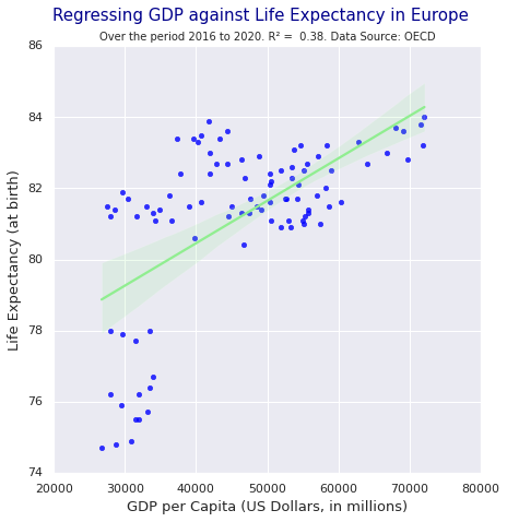
Although the project generally focusses on eleven countries, for the map chart, data for as many European countries as possible was incorporated to achieve a better replica of the geography. Similarly, for the regression a larger number of data points were included to increase the accuracy.
To produce charts which automatically update, use of APIs is required. However, I could not find many APIs for my topic. The ones I did find were the ONS API for the UK GDP, which could have been incorporated in a graph solely regarding the UK, but I wanted the comparisons to run throughout my project; and the Covid-19 API, which links to health. However, I chose not to include the Coronavirus pandemic as I believe managing it does not necessarily show how effective a country’s health care system is, but more how prepared the government was for a pandemic. Although APIs are beneficial, an advantage of data uploaded to GitHub is that it can never go down, which is a possible concern with APIs.
One issue which came to light was that some of the data downloaded from the WHO API was in a format that Vega Lite could not read, as the value had standard deviations in brackets. Unfortunately, I was not able to wrangle these in Python, hence I looked for other data.
Another issue was that in the topojson the UK was split into England, Northern Ireland, Scotland and Wales, while my data provided figures for the UK. Therefore, I manually adjusted the data to match the topojson.
Preparation work to get my data into the right format involved merging datasets from different sources. I did this in Stata to ensure that data points for each country would join up smoothly and to avoid any mismatch errors that could occur when doing this manually in Excel. Stata was also useful in dropping unneeded variables.
Excel was, however, used when performing calculations such as for chart 6 to compute the percentage increase in life expectancy over the period for each country, and for chart 4 when calculating the average obesity prevalence in the whole population.
Google Colab was used to convert two csv files into the right format to run a regression, and then to perform the regression for chart 7.
To conclude, countries with higher GDPs, such as the UK, have higher ratings of access to contraception, longer life expectancies at birth but also larger rates of obesity in the population. The first two findings would suggest that higher GDPs indicate a better health system, while the latter indicates the opposite.
Most of the eleven countries’ governments have consistently spent between 10 and 16 percent of their total expenditure on health. Poland always spends less than this. It also has the lowest life expectancy out of the countries, a low rating of access to contraception: 35.1%, and longer waiting times for specialist treatment. Whereas Germany spends more on health, has a higher life expectancy and better access to contraception. Germany also has a higher GDP. Comparing these two countries suggests that a higher GDP does in fact result in better health care. However, this cannot be concluded merely by comparing two countries.
Overall, without increasing the size of this project to include more countries, or even undertaking it on a global scale, it is hard to determine whether GDP affects healthcare. However, the data I used does indicate that countries with higher GDPs (in Europe), have higher life expectancies. Furthermore, as GDP has increased in Europe since 1960, infant mortality rates have decreased. Both these are positive indications for health care quality.